
Name tag font size: how big should the text be?
Short answer. For most name tags we use 24 pt for the first name, 18 pt for the last name and 14 pt for the title (in a font like Arial). The first name's capitals are then about 1/4 inch (6 mm) tall: easy to read in conversation and still readable up to about 1.3 m (4 ft). That is enough in most workplaces, where the name is read up close. If your name tag must be read as people walk up to you — across a counter, at an event, in a hospital — the research below shows how far to go: capitals of 3/8 inch (about 38 pt) to 1/2 inch (about 50 pt). In every case: a plain bold sans-serif, dark text on a light background (or white on a dark one), and a title smaller than the name.
Step 1: how far away is the person reading your name?
A name tag is not read from arm's length like a book. It is read by someone standing in front of you, usually for half a second, often while you are both still moving. So the first question is distance.
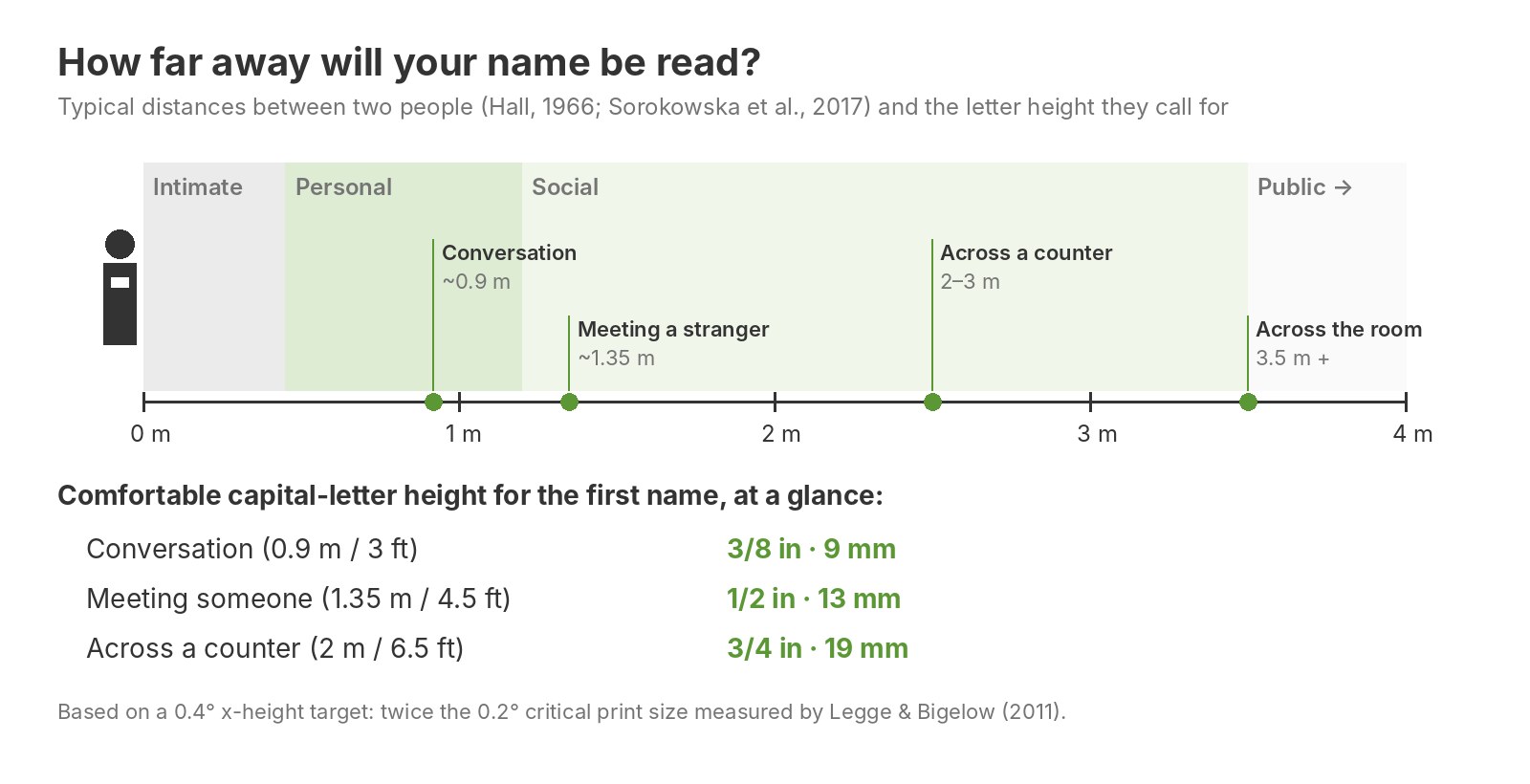
The anthropologist Edward T. Hall described four "zones" of interpersonal space in The Hidden Dimension (1966): intimate (up to about 45 cm / 18 in), personal (45 cm to 1.2 m / 1.5 to 4 ft), social (1.2 to 3.5 m / 4 to 12 ft) and public (beyond 3.5 m). Customer service, networking and introductions happen at the border of the personal and social zones.
A much larger study measured this directly. Sorokowska and colleagues asked 8,943 people in 42 countries how close they would stand to different people (Journal of Cross-Cultural Psychology, 2017). On average, people placed a stranger at about 135 cm (4.4 ft), an acquaintance at about 92 cm (3 ft) and a close person at about 32 cm. A compilation of personal-space surveys by the language platform Preply, reported by NOW Toronto, put Canadians' comfortable distance from a stranger at around 1 metre (3.4 ft).
In practice, a name tag gets read at three moments:
- Conversation: about 0.9 m (3 ft).
- Greeting a stranger or a customer: about 1.35 m (4.5 ft).
- Approaching — across a counter, a reception desk or a room: 2 to 3.5 m (6.5 to 12 ft).
Step 2: what vision science says about text size
What matters to the eye is not the size of the letters in inches or points, but the angle they cover in your field of view. The same 1/2-inch letter looks big at 1 metre and tiny at 5 metres.
Gordon Legge and Charles Bigelow, a vision scientist and a type designer, reviewed decades of reading research in the Journal of Vision (2011). They report that people with normal vision read at full speed as long as the x-height (the height of a lowercase "x") covers at least about 0.2° of visual angle — the "critical print size". Below that, reading slows down sharply. Newspapers and books sit right around 0.2° to 0.25° when held at 40 cm.
That 0.2° is a minimum for focused reading in good conditions. A name tag is read at a glance, under store or banquet lighting, often at a slight angle, by people of every age — and earlier research by Whittaker and Lovie-Kitchin (1993) found that comfortable reading needs text several times larger than the smallest size the eye can make out. So we use 0.4°, twice the critical print size, as the target for a name that people read effortlessly. As a cross-check, the U.S. accessibility standard for signs (ADA 2010, section 703.5.5) asks for capital letters of at least 5/8 inch read from under 6 feet — almost exactly the same angle.
Converted to capital-letter height for a typical sans-serif font, this gives:
| Capital-letter height | About (Arial) | Comfortable at a glance up to | Still readable, with effort, up to |
|---|---|---|---|
| 1/8 in (3 mm) | 13 pt | 0.3 m (1 ft) | 0.7 m (2 ft) |
| 3/16 in (5 mm) | 19 pt | 0.5 m (1.6 ft) | 1 m (3 ft) |
| 1/4 in (6 mm) | 25 pt | 0.7 m (2.2 ft) | 1.3 m (4.3 ft) |
| 3/8 in (9.5 mm) | 38 pt | 1 m (3.2 ft) | 2 m (6.5 ft) |
| 1/2 in (13 mm) | 50 pt | 1.3 m (4.3 ft) | 2.6 m (8.7 ft) |
| 5/8 in (16 mm) | 63 pt | 1.65 m (5.4 ft) | 3.3 m (10.8 ft) |
Point sizes vary from one font to another: a font with tall capitals reaches the same height at a smaller point size. That is why we talk in inches and millimetres of the actual letters, not in points.
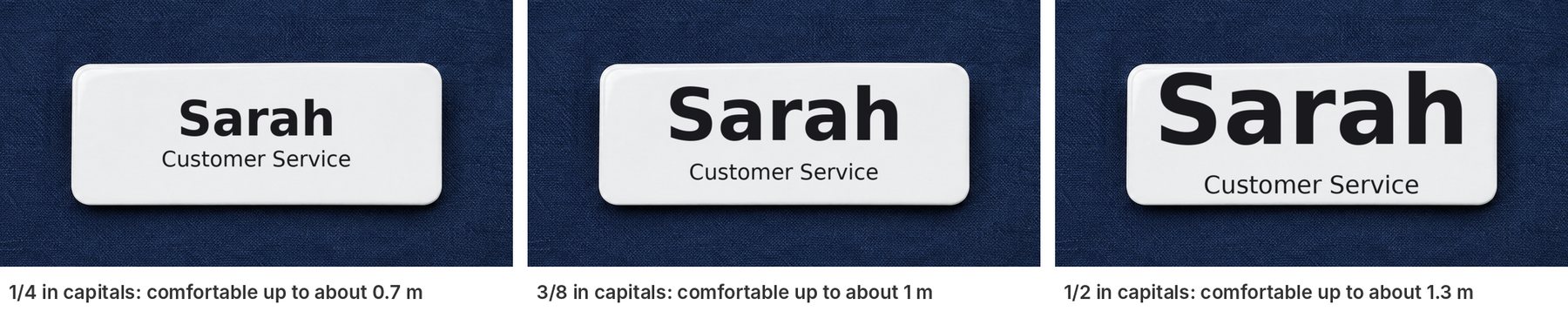
On a standard 1 × 3 inch tag, 3/8 inch is about the largest name that still leaves room for a title. If you want a 1/2-inch name, choose a 1.5-inch-tall tag so the layout can breathe.
Step 3: the name first, everything else second
Only the first name needs to carry. The job title, department or "Ask me about…" line is read once the conversation has started, at handshake distance. Around a third of the name's height (1/8 inch, about 13 pt) is enough for it — and anything smaller than that becomes decoration rather than information.

Look at the photo above from your screen: from the customer's spot about two metres away, "Sophie" reads instantly, the title underneath does not. That is the right priority. If the title matters from a distance too (a pharmacist, a security guard, a first-aid volunteer), give it its own larger line or a coloured band rather than shrinking the name.
Choosing a font that is readable — and still looks good
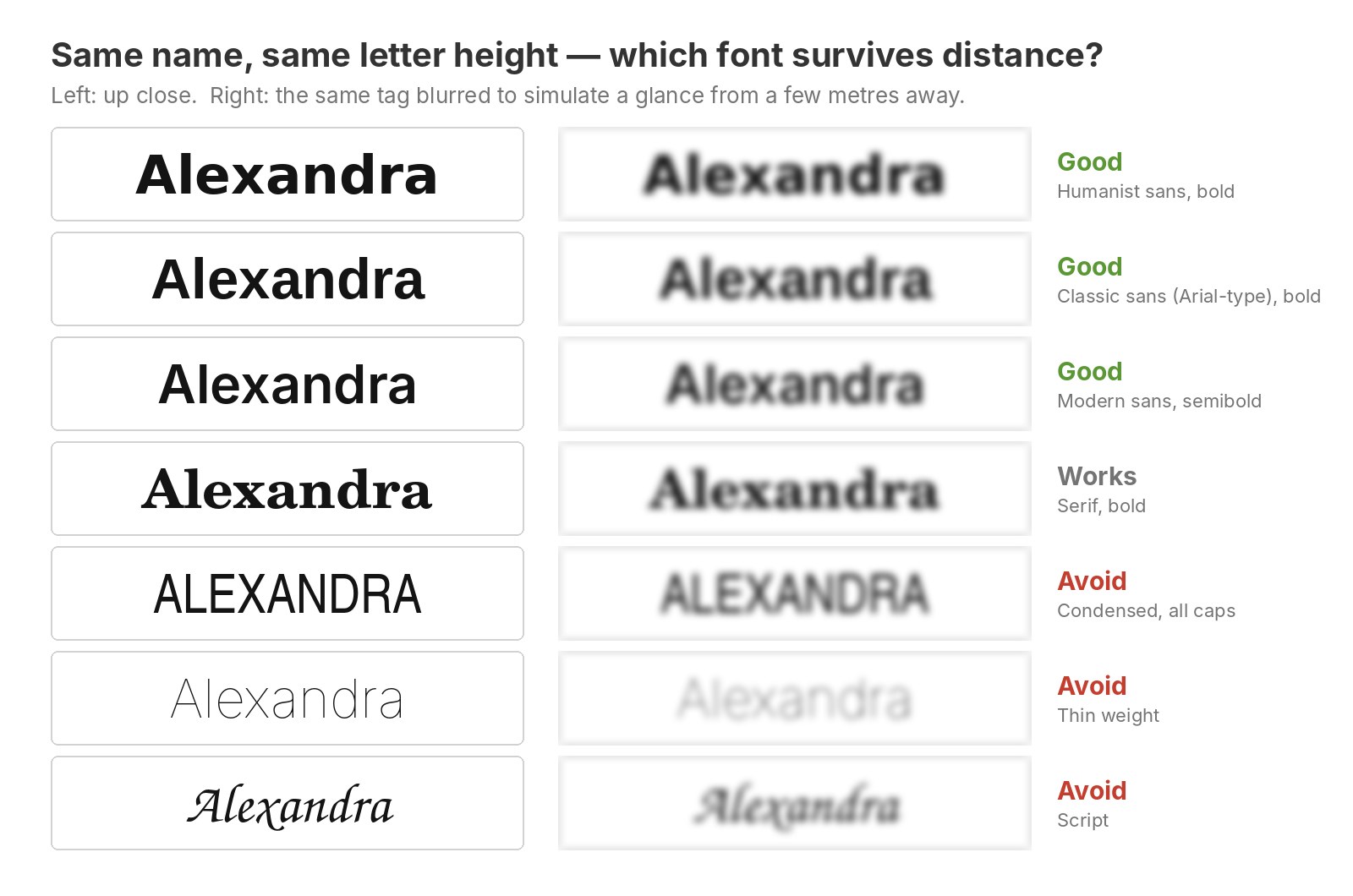
Use a plain sans-serif in bold or semibold. Fonts with open, clearly shaped letters survive distance and quick glances best. In a study from MIT's AgeLab published in Ergonomics (Reimer et al., 2014), a "humanist" sans-serif with open letter shapes cut the time men needed to read text at a glance by 10.6% compared with a tighter, square "grotesque" style. Good choices: Arial, Helvetica, Verdana, Myriad, Frutiger-style and other clean sans-serifs, or Arial Rounded for a softer look.
Serifs are not the problem. Arditi and Cho (Vision Research, 2005) found essentially no difference in legibility between otherwise identical fonts with and without serifs. A sturdy serif in bold works well for a hotel, a law firm or a winery. What hurts is thin strokes, not serifs.
Avoid script, thin, condensed and decorative fonts for the name. They look elegant on screen but collapse into a blur at two metres. If your brand uses one of these, keep it for the logo and set the name in a clean companion font.
Prefer Title Case for names. All capitals take more width, so on the same tag the letters end up smaller, and word shapes become uniform rectangles. In a highway-sign study for Pennsylvania (Penn State, 2013), a well-designed mixed-case font matched all-capital lettering in legibility distance while taking less space. For a name tag, "Alexandra" in Title Case is usually the better use of the space than "ALEXANDRA".
Give letters a little room. Letter spacing is one of the most consistent factors in small-text legibility, and an overly tight font with letters touching reads worse than the same font tracked slightly open.
Contrast matters as much as size
Laboratory studies show that reading slows down when contrast drops (Legge, Rubin & Luebker, 1987), especially at small sizes, so text that is barely darker than its background needs to be much larger to be read. Black on white, white on navy, white on black and dark text on brushed silver all work. Gold on silver, grey on white and pale colours on pale colours do not.
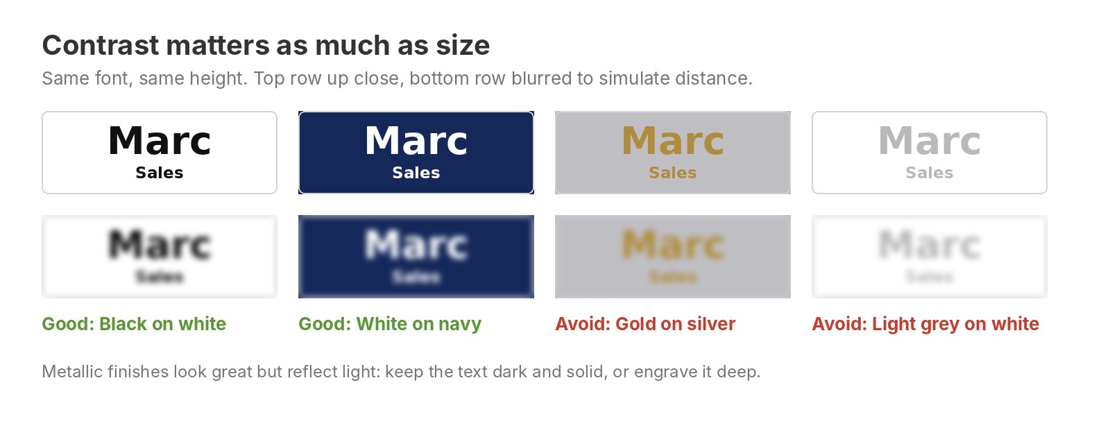
Metal and glossy finishes reflect light, which lowers contrast from some angles. On metal name tags, keep the name solid and dark; on engraved plastic, pick a colour pair with a strong light/dark difference.
Making it pretty, too
- One or two fonts, no more. A clean font for the name and, if you like, your brand font for the logo or company name.
- Clear hierarchy. Name largest, title at about a third of that, logo small enough that it does not compete with the name.
- Margins. Leave at least 1/8 inch of empty space around the text. A name squeezed edge to edge looks cheap and reads worse.
- Same layout for the whole team. Same font, same size, same position: customers learn where to look, and short and long names look equally intentional.
- Long names: go to a wider tag or a two-line layout before you shrink the letters or switch to a condensed font.

What we use by default: 24, 18 and 14 pt
In most workplaces, reading the name from across the room is not the point. Employees are identified at the counter, at the desk or in conversation, and the tag also has to carry a logo and a title on a 1 × 3 inch surface. That is why our standard layout is 24 pt for the first name, 18 pt for the last name and 14 pt for the title: the name is comfortable to read up to about 0.7 m and still readable up to about 1.3 m, and the whole tag stays balanced and good-looking.
The research above is there to help you ask for something different when your context is different. If your staff greet people who are still a few steps away — a reception, an event, a hospital, a store where customers look for help from the aisle — ask us for a larger first name (32 to 50 pt) and a taller tag. If the name is only read at handshake distance, 24 pt is plenty.
The same name tag at four distances
To show what 24 pt looks like in real life, we placed the same name tag (first name 24 pt, last name 18 pt, title 18 pt italic) in a café at four distances. Each image is framed so the name tag appears at its true size for that distance.
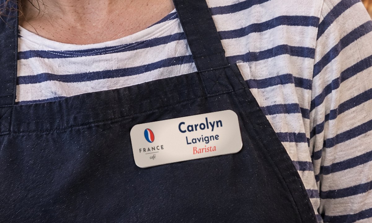
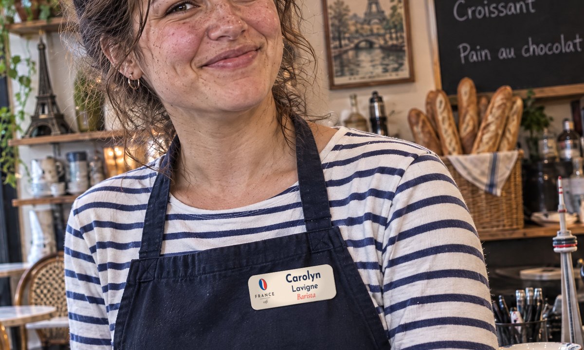


Fictional café and AI-generated scenes; the name tag is our real design, scaled to its true size at each distance.
The two-metre test
Before ordering, print your design at 100% size, pin it to a shirt and step back two metres (about 6.5 ft). If you can read the name in one glance without squinting, it works. If not, make the name bigger before you change anything else. When you request a quote, we send a free proof of your actual design, and we can tell you which name size fits your tag.
Sources
- Legge, G. E. & Bigelow, C. A. (2011). Does print size matter for reading? A review of findings from vision science and typography. Journal of Vision, 11(5):8. doi.org/10.1167/11.5.8
- Sorokowska, A. et al. (2017). Preferred interpersonal distances: a global comparison. Journal of Cross-Cultural Psychology, 48(4), 577–592. doi.org/10.1177/0022022117698039
- Hall, E. T. (1966). The Hidden Dimension. Doubleday.
- Whittaker, S. G. & Lovie-Kitchin, J. (1993). Visual requirements for reading. Optometry and Vision Science, 70(1), 54–65. PubMed 8430009
- Reimer, B. et al. (2014). Assessing the impact of typeface design in a text-rich automotive user interface. Ergonomics, 57(11), 1643–1658. MIT DSpace
- Arditi, A. & Cho, J. (2005). Serifs and font legibility. Vision Research, 45(23), 2926–2933. PMC4612630
- Legge, G. E., Rubin, G. S. & Luebker, A. (1987). Psychophysics of reading. V. The role of contrast in normal vision. Vision Research, 27(7), 1165–1177. PDF
- Pennsylvania State University (2013). Legibility of the Clearview typeface and FHWA standard alphabets on negative- and positive-contrast signs. Report PSU-2013-02
- 2010 ADA Standards for Accessible Design, 703.5.5 Character height. Section 703
- NOW Toronto. How big is your bubble? Study reveals how much personal space Canadians need. nowtoronto.com
Ready to order your name tags?
Free shipping across Canada, no minimum quantity, production in 1 to 2 business days. From $10.99 each.
Free proof before anything is produced — and we can mail you a stock sample of the materials and finishes so you can feel them before you decide.